latest blog entry
OSX Tooltips
October 26th, 2005, By Duncan Gough
Tiger is a fine OS but it does feel like a small step backwards over all the other releases. I’ve never owned a mac pre-OSX, so maybe I’ve been spoiled. My biggest gripe with OSX is the Dock. Yes, I know of all the reasons why it is not a good application launcher and so on but what really annoys me is one simple thing, the tooltips.
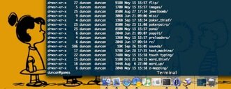
When you mouse over an application in the Dock, a tooltip appears to tell you what it is. Nothing wrong with that. However, in my day to day usage, the following happens (click for the larger version):
It’s subtle. The kind of thing that builds up and eventually starts to really, really frustrate. Like this – I do most of my work in the Terminal, so I mouse down to the Terminal icon in the Dock, click it to bring it to the front and let go of the mouse as all my work in the Terminal is keyboard based. Quick thought – is it wrong to let out a mental sigh of happiness when I let go of a mouse? Are GUIs that bad? Anyway, I get to work, start writing some code, or, as sys-admins would have us believe, creating bugs with the occassional line of working code thrown in.
Then, there it is. Look again:

Argh! The ghostly word Terminal is still hanging there because I clicked on the icon and just let go of the mouse as soon as I was given the chance. Argh! Not fair. Can’t it fade out after 30 seconds. Can’t it revolve, swirl and dissappear into a liquid bed of transparent nothingness, because we can?
No! It must stay visible for all time, it would seem. I don’t want to count how many times a day I end up flicking my hand at the mouse or trackpad to get rid of the tooltip. As any keyboard addict knows, after you’ve put the time and effort in to learn all those shortcuts, taking your hands away from the keyboard is a sin.
Please Apple, in the next OS release can you have the Dock tooltips fade out?

